

Cerritos Children's Library
CASE STUDY
OBJECTIVES:
MY ROLE:
With technology constantly evolving and making break through conventions, libraries tend to become easily outdated. Nowadays, books are becoming e-books or read on-line. Videos are being live-streamed. Researches can be done on-line on the world wide web. To have a competitive advantage over other educational institutions, Cerritos Library will need to think of ways to upgrade their printed resources and materials. They will need to transform to be more on top of technological changes. For this project, I’ll focus more on the Children’s Department at the Cerritos Library.
1. Update the Children’s Department Library website to appeal to children who are more tech savvy.
2. Create the ability to use a more user friendly library database system to search, watch videos, and find or even read books on-line.
3. Access to a wide technology resources; for example, booking study room appointments, computer time reservations, study sessions with tutors, and etc.
4. Collaboration and partnership with local district schools to complete projects and on-line extracurricular assignments at the library.
5. Adapt to changes more quickly and stay up to date on the evolving technology.
UX/UI Designer
The challenge is updating the Cerritos Library System to accommodate the new technology educational system. They will need to start a program to slowly transition the hard-bound books to become on-line books. This will change or do away with the checking library books out process. This will also free up space in the library for more study rooms, classes, student interactions activities, tables, and add more resources.
MOOD BOARD
TEXTURE:
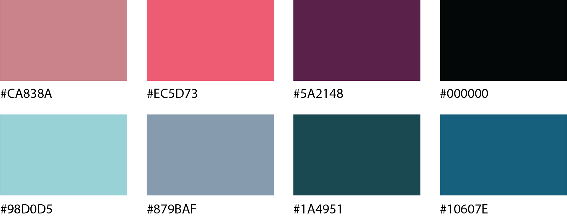
COLOR PALETTE:

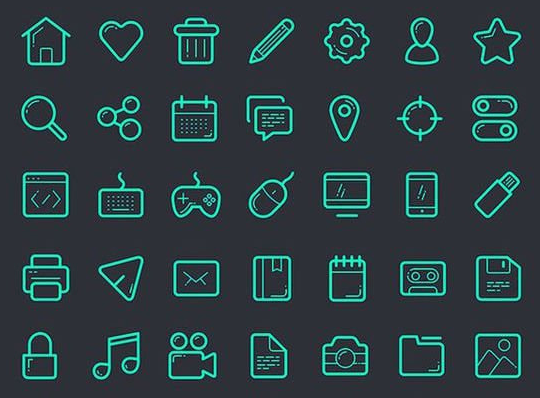
ICON SET:
FONTS:

BRANDING AND LOGO EXAMPLES:
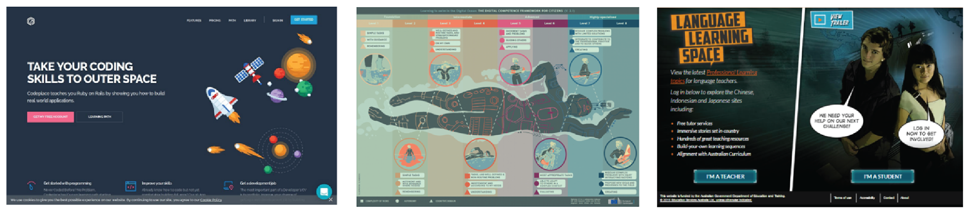
WEBSITE EXAMPLES:
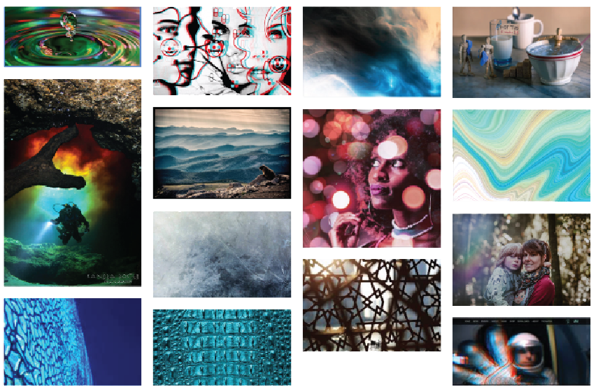
MOOD BOARD:
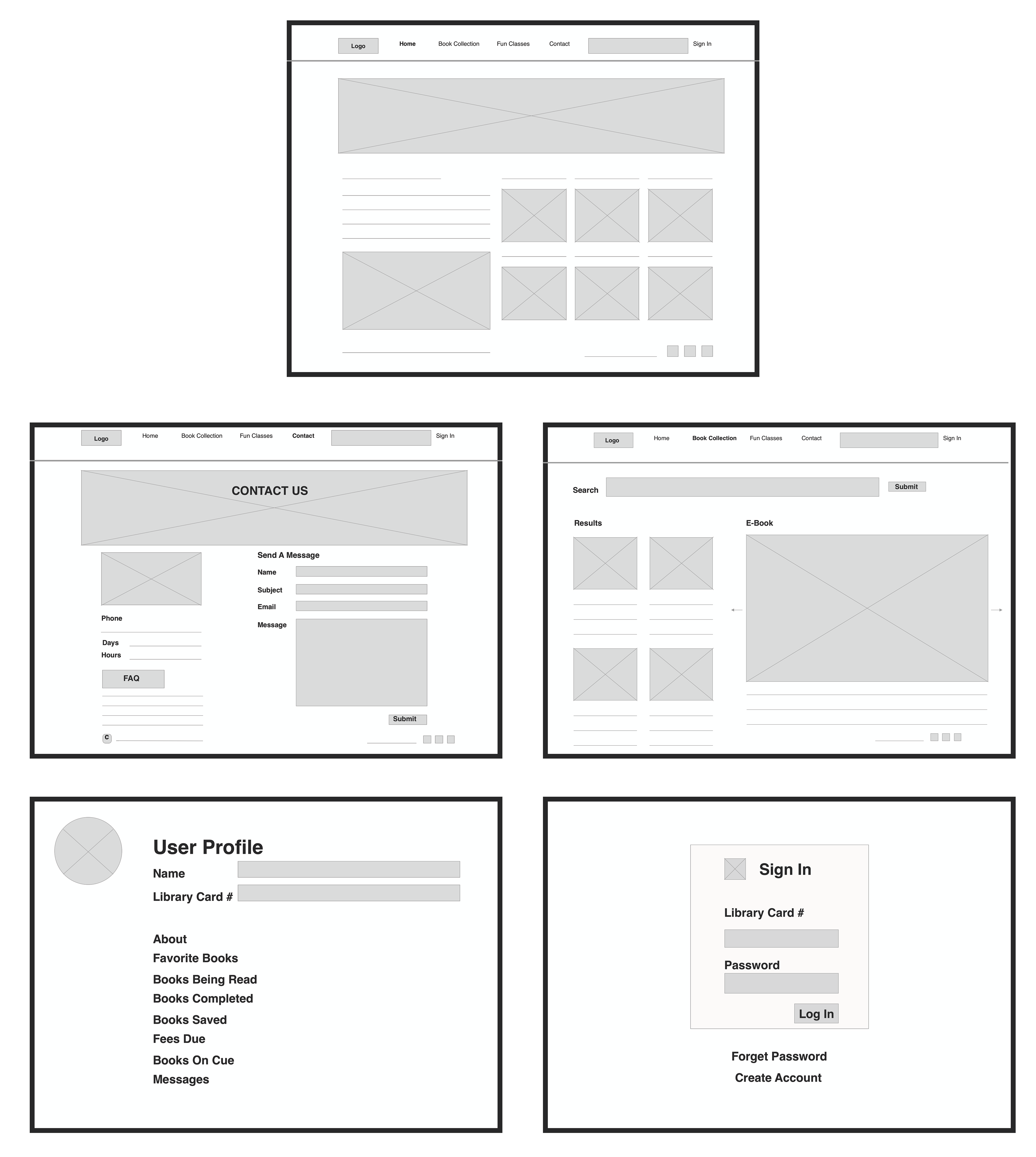
WIREFRAME:
My design inspirations align with the brand of the organization by incorporating more organic patterns and textures similar to how the library is structurally designed. I plan on creating an upgraded more aesthetic appeal and moving away from the young children, school book look. I like to use imagery that evokes motion and repetition. There are strong lines and shapes used throughout the building.
The intended mood and emotion evoked by the mood board is inviting.
I would like to use these colors and design to bring curiosity and interests. The library is designed as an organic structure. I like to incorporate that into the website design.
I would like to use these colors and design to bring curiosity and interests. The library is designed as an organic structure. I like to incorporate that into the website design.
INTERACTIONS:
The interactions that I used for these pages are simple. They are tap animations which will navigate you to the next page by clicking on header links. The transitions will take you to the previous artboards or next one. I’m also considering the dissolve or overlay transitions to add more variations. The interactions incorporated throughout the website will make the website easy to navigate through.
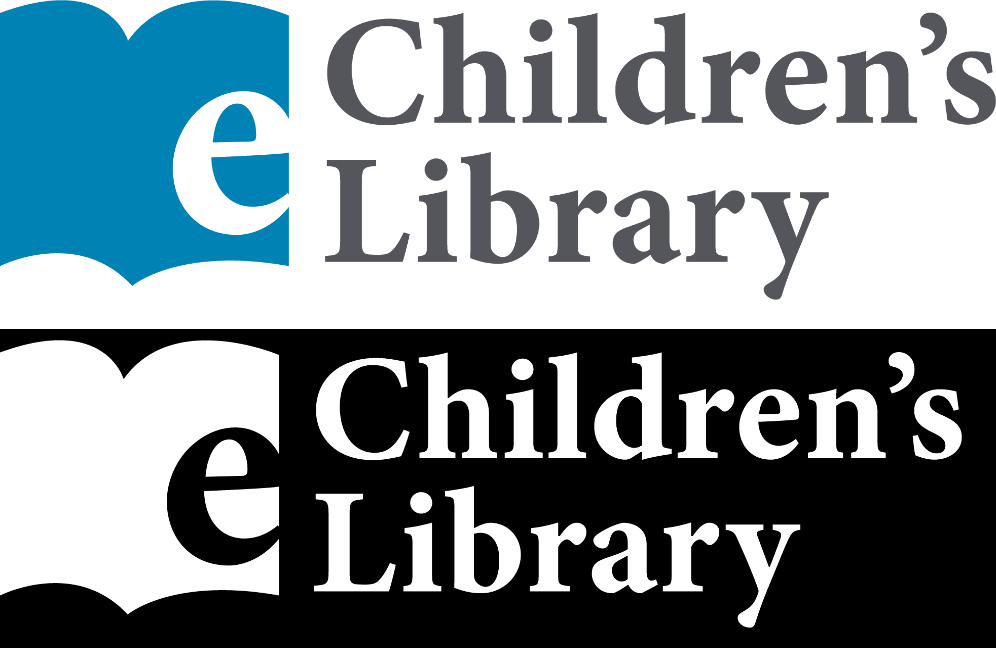
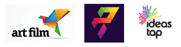
LOGOS:
For the Children’s Library logo, I designed two versions. One is in color and the second one in all white. I wanted to give the client 2 options. The white logo will be a good option to use on a solid color background.
The logos communicate reliability and friendliness. To help convey that message in the logo, I chose to use a sea blue color and a school book text similar fonts. “E” stands for E-Book. So, I incorporated an electronic book symbol into a logo to communicate e book and give it a fun look.
COLORS:
FONTS:
FUTURA
ABCDEFGHIJKLMNOPQRSTUVWXYZ
abcdefghijklmnopqrstuvwxyz
1234567890
VISUAL DESIGN:
With the Children Library website, I want to give the user the feeling of movement and calmness. So, I used colors and fonts that made the pages more fun for the children to read. The blue color represents trust, peace and loyalty. And, the purple is more for the imagination and creativity.
I kept the overall look of the website to be conservative with all the pages looking cohesive. I gave the user the option to add a little bit of personality to their User Profile Page. Overall, it’s a fun site.

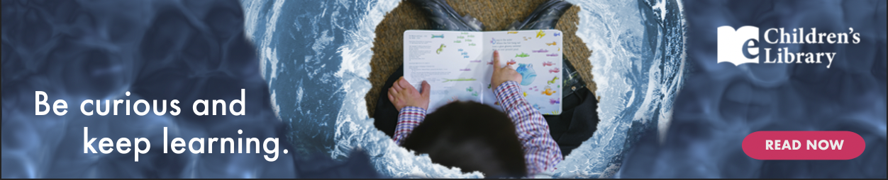
WEB BANNERS:


RESULTS:
My design meet the needs of the organization I designed for by having a professional, yet interesting and fun children’s library website for all ages. The navigation is easy to follow. The images and text are readable. Everything seems clear to understand.
In conclusion, the overall goal of the Children’s Library website is to be up to date with current technology and make it easier for the user to efficiently utilize the online electronic book database and offerings.